About This Project
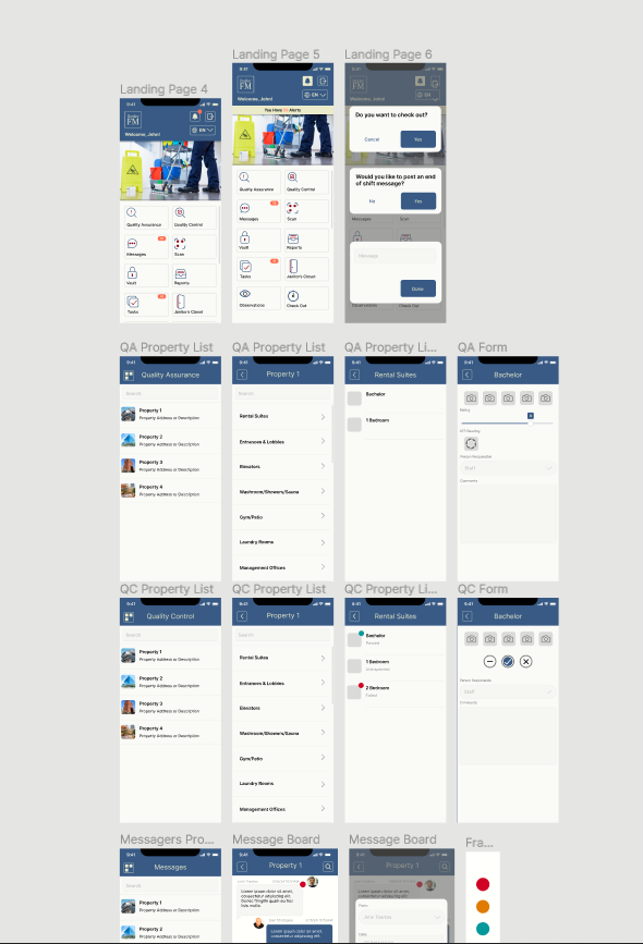
In late 2023 right after college graduation, I was asked to help design the user interface for a janitorial services application called ButlerFM. By this point, the app had been in development for the better part of two years and relied largely on placeholder graphics for user testing and early access builds to clients. The aim of this project was to update the user interface with a more modern aesthetic that gave ButlerFM its own sense of identity and visual style while also remaining functional and intuitive.
Development on the user interface was largely done on Figma, however this typically came after brainstorming on a sketchpad. I was given a full list of necessary pages and functions that the app needed to incorporate into its user interface. From there I created a skeletal layout of each page with a list of necessary features and sub pages that existed only in text before I began working on them one by one, starting with a base layout that would serve as the foundation for the structure and aesthetic of each page.
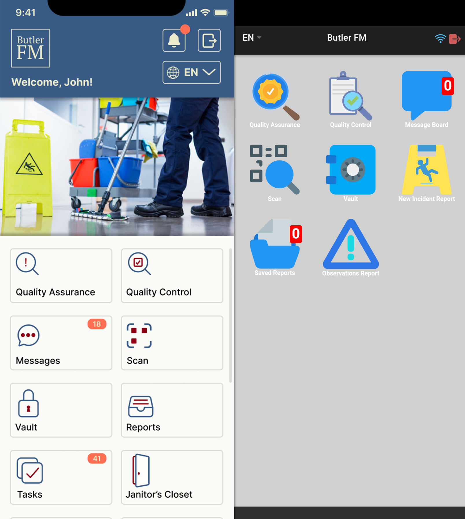
The primary goal with this design was to create an experience that was both more personalized and more aesthetically cohesive than the existing UI (pictured in the first image on the right). My solution for this was to create a visually distinct home page that reacted to information supplied by the user, specifically the name associated with the account, add an editable image that companies can modify to personalize the app for their employees, as well as implementing the ButlerFM logo into the design of the home page.
After the initial pass of each page was finished, I worked personally with both the CEO and the head of ButlerFM's back end in order to iron out any areas that didn't fit in accordance to the app's initial design and fulfilling additional requests. These included things such as priority indicators for messages, the implementation of an alert system on the main page, and specifications regarding display information.
After approval on each page was met, I focused on selecting a color pallet. The draft pallet that I used during the majority of the design process involved a very bright, very loud blue with white and gray secondary colors that made the design feel cheap and difficult to look at at times. I transformed this into an less offensive Mas blue with beige, red, and off white secondary colors in order to give the app a more professional, tetradic pallet.