About This Project
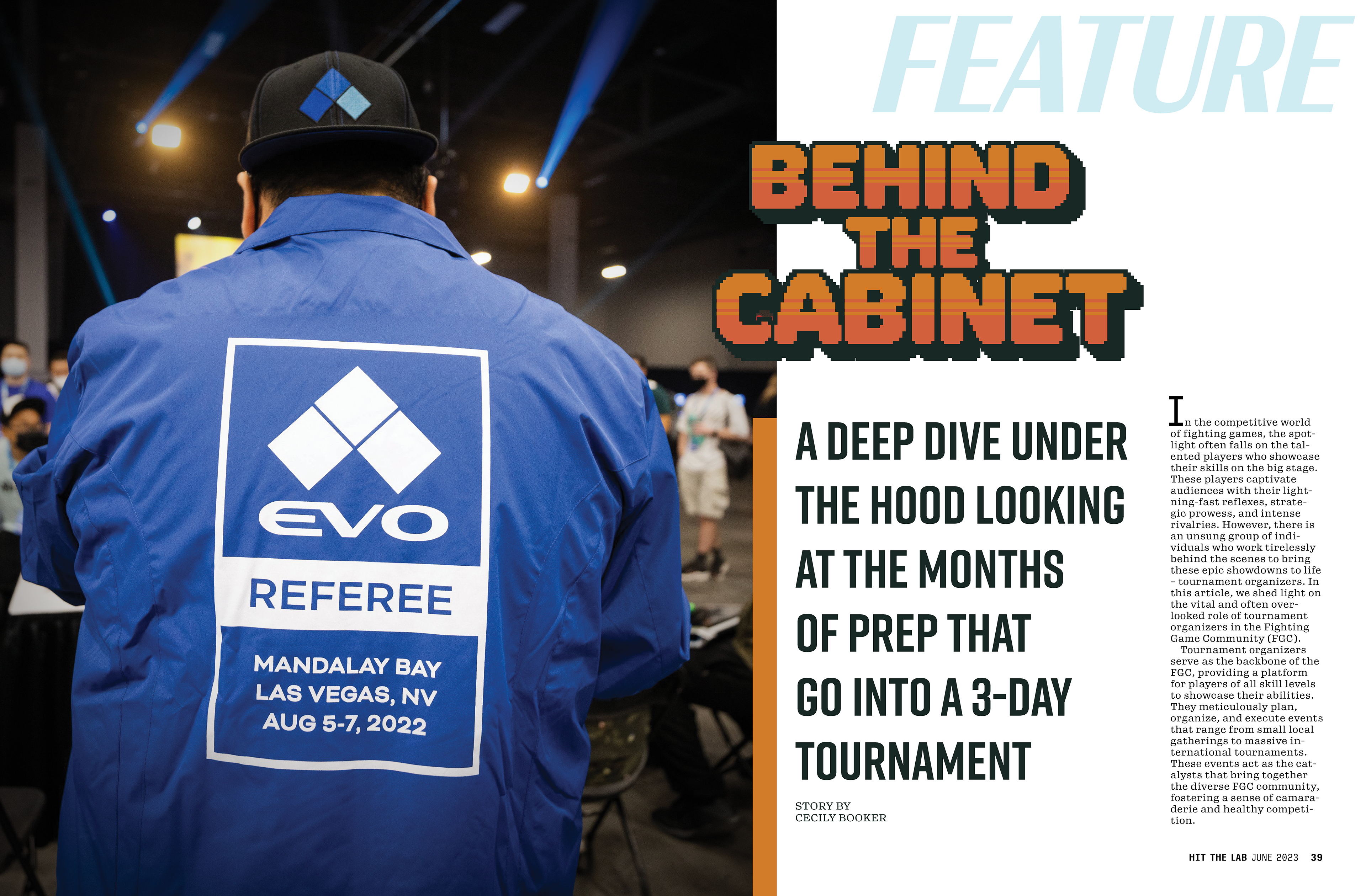
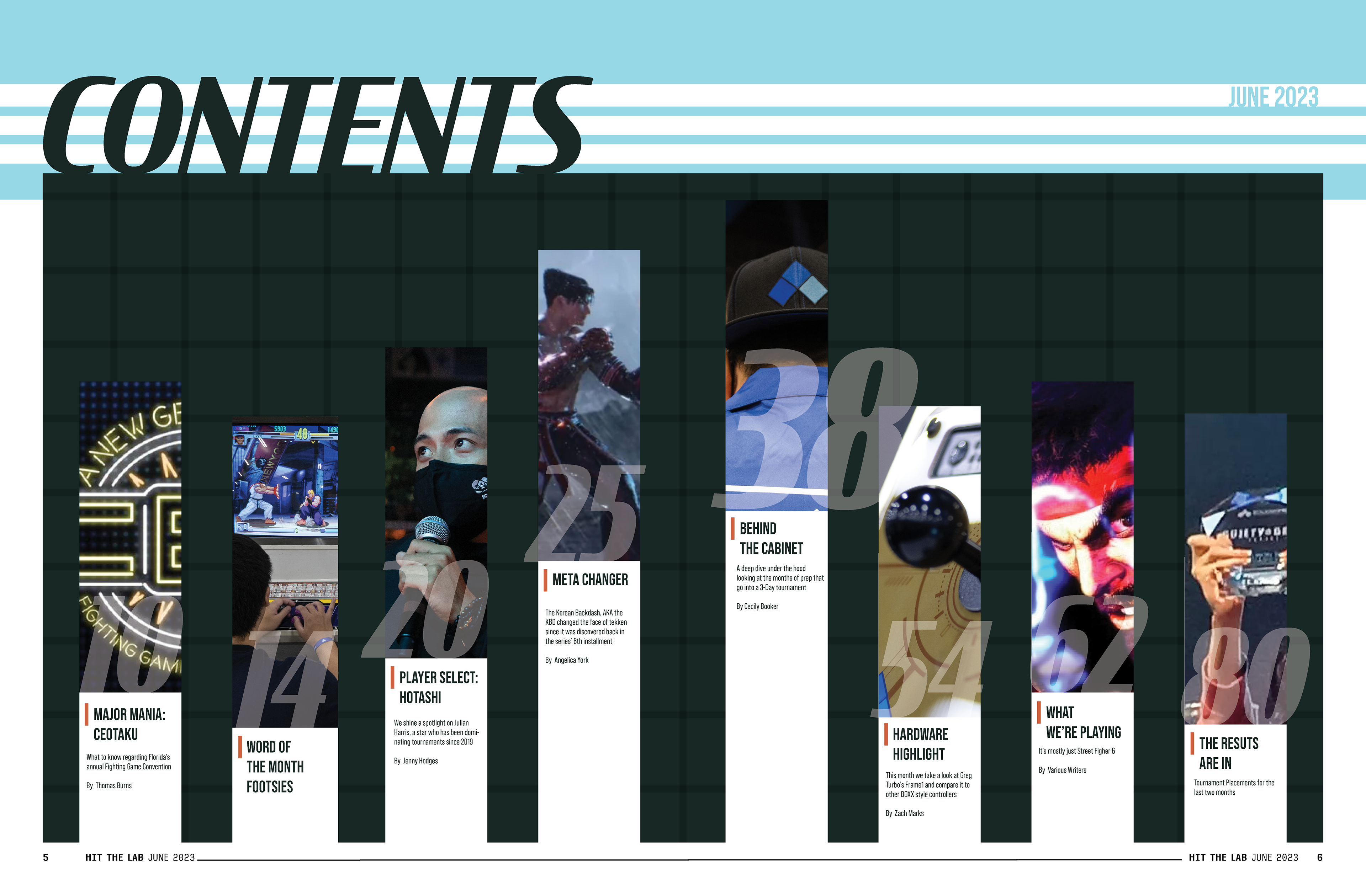
During my last year at Simon Fraser University, one of the courses I took focused on designing a magazine for print. Students were tasked with creating a magazine, designing its branding, contents, subscription model and making a prototype of the cover, feature story, table of contents, and mailing letter. This project, unlike many others in my educational career, was a completely solo endeavor that gave each student 7 weeks to complete from conceptualization to the final product. This was a course that tested my ability to manage myself and set my own deadlines as there were no due dates for milestones and at a 400 level course the professor was beyond guiding us through each step of the process. The magazine I created was called "Hit The Lab" and it's content was focused on the hobby of competitive arcade style fighting games.
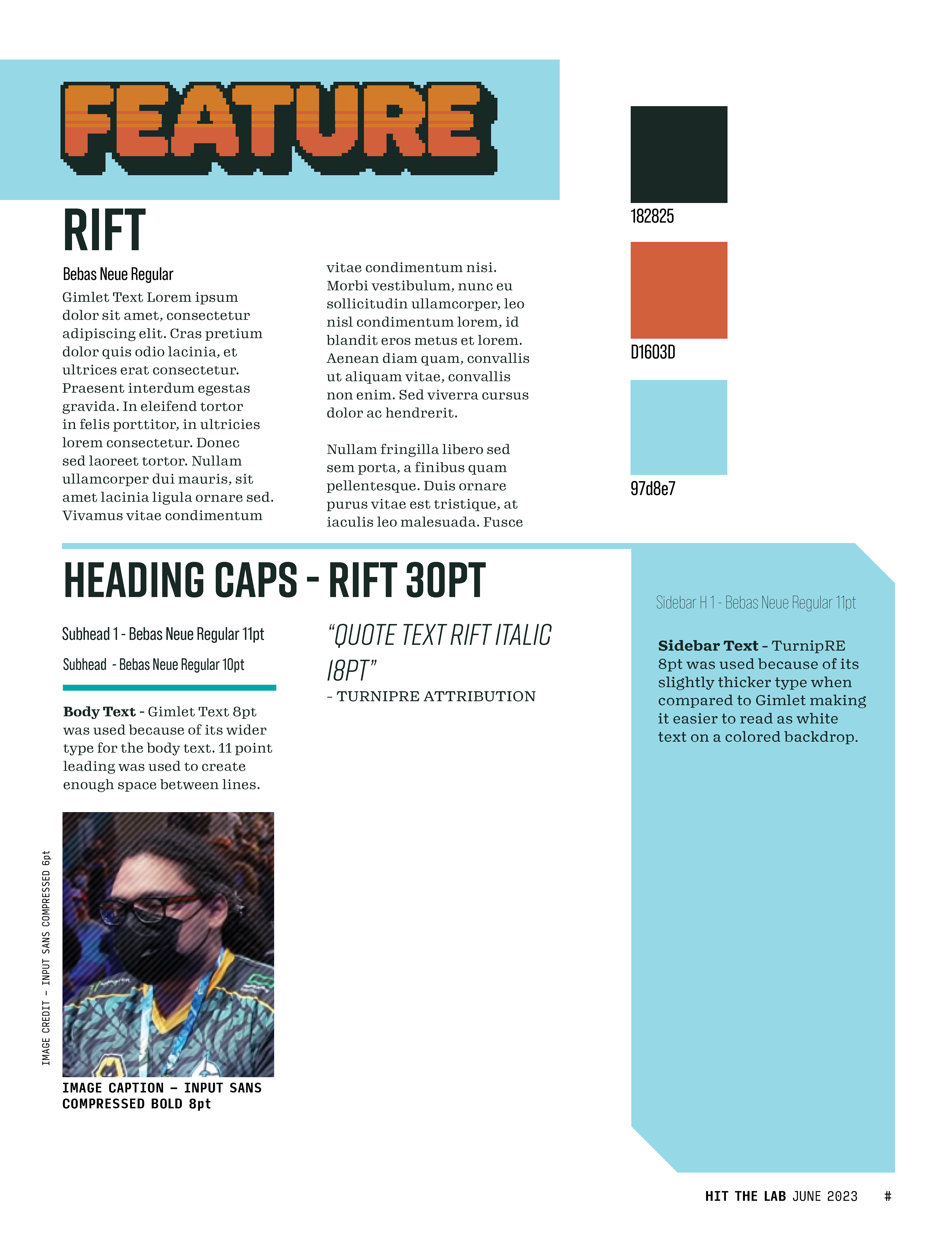
The process began with a blank spread in Adobe InDesign, serving similar to a white board that one could write down ideas or place sticky notes. Here I got to play with different fonts and color pallets to see how well they complimented one another. Visual cohesion is a vital element of any type of page design that can make or break the flow of information. The entire magazine must maintain a level of aesthetic uniformity in order to compliment the branding and so that flow from page to page isn't broken up by something tonally distracting.
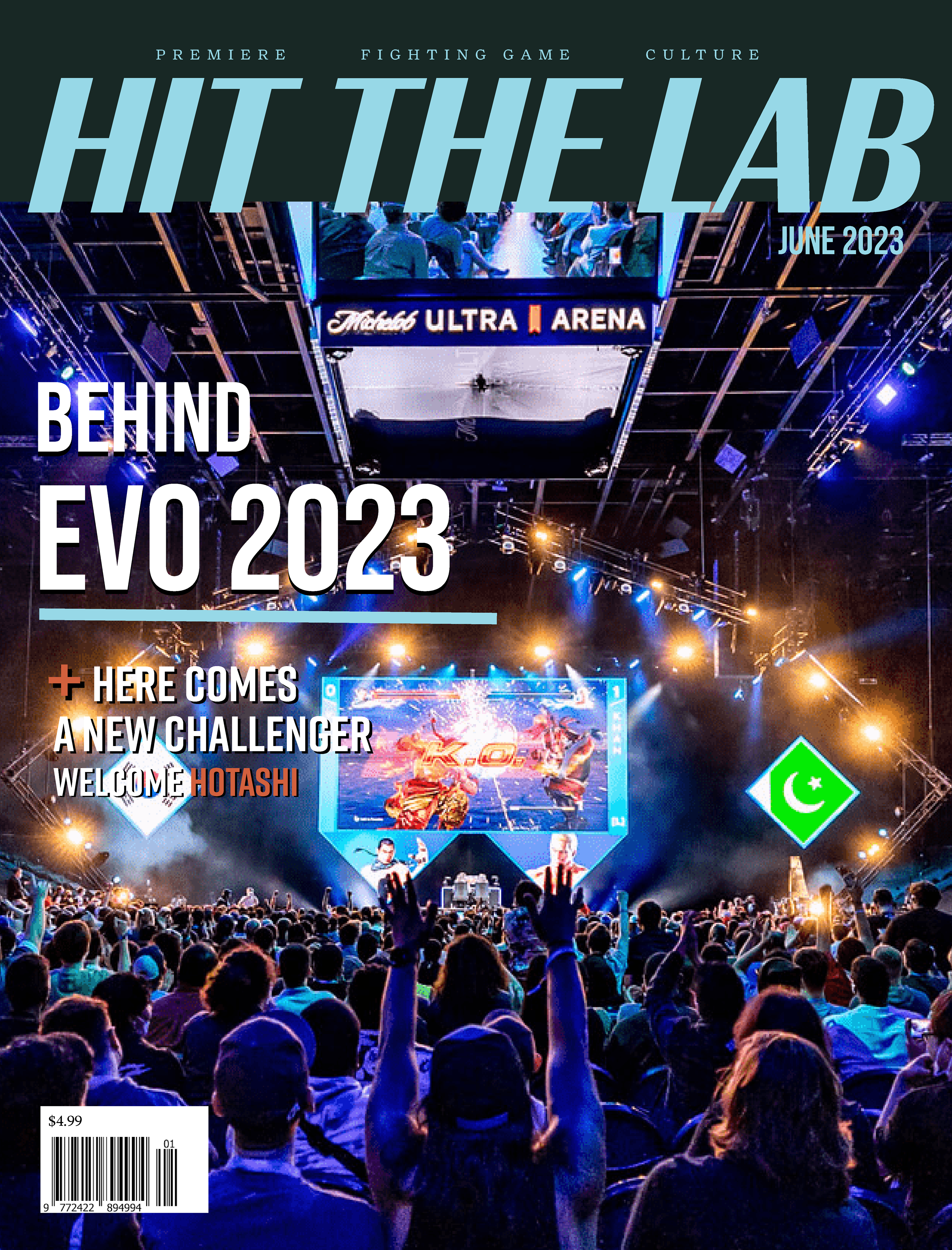
After setting up the reference page for the rest of the magazine, the next step was to create a name and cover that would adequately convey the contents without the reader needing to open it. The name 'Hit The Lab' was chosen because of the connotations of The Lab in fighting game circles to refer to the games training mode where one may test out and execute new techniques in order to gain the edge in competitive matches. The word Hit was added both to turn the title into a command, something that felt like it was directly addressing the reader and because the word Hit helps convey the genre of the games to those unfamiliar with the terminology.
It is difficult to stress the importance of visual cohesion between all elements of the magazine. The goal is for the reader to never forget the magazine that they are actively reading and for every element of the page to serve as a reminder to this fact.
Photography Attribution
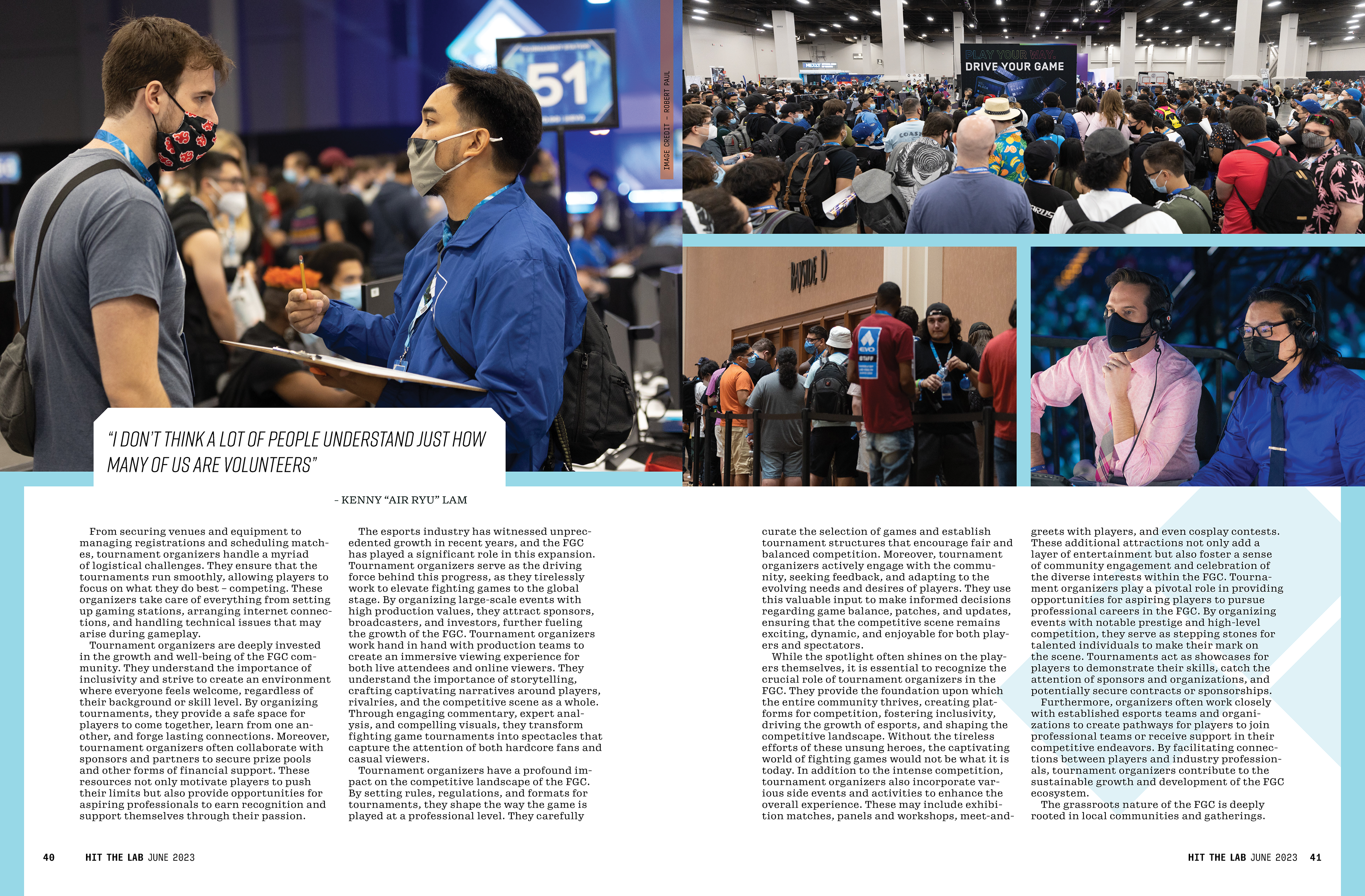
Photography used for this project is not my own and was taken by Robert Paul (https://gallery.rmpaul.com/) for the Evolution Championship Series