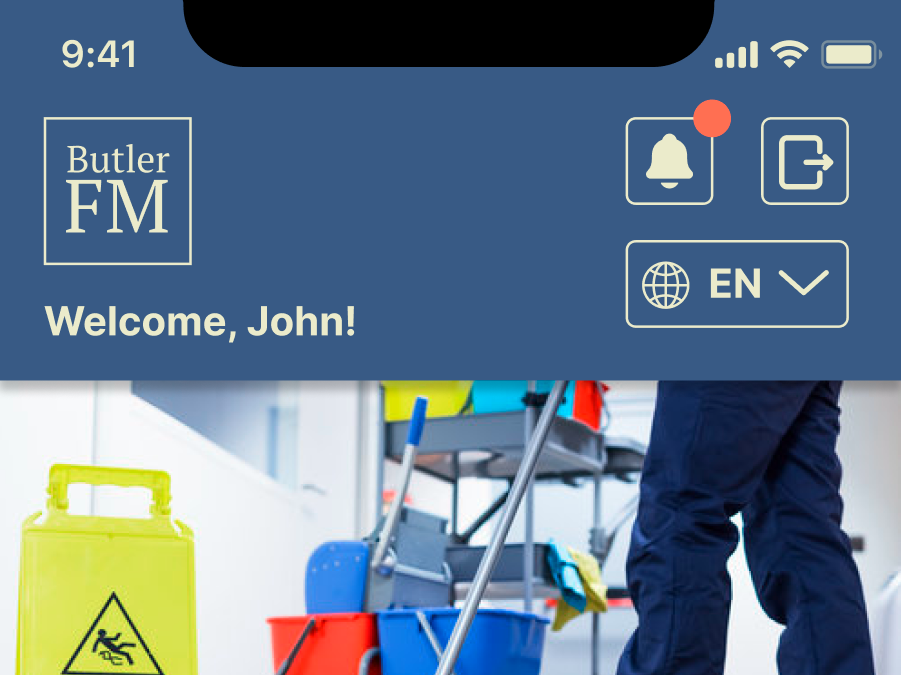
The property page for ButlerFMs new mobile site,
About This Project
Following my work on the ButlerFM mobile app, the next step was to update the accompanying web portal to be more in line with the UX standards of the new platform. In the beginning of this process, the existing ButlerFM web portal primarily functioned as a developer tool, with every single page accessible from a dense home screen and a side menu consisting of 15 tabs, 13 of which expand into drop down menus containing even more pages to click on. My goal was to improve the navigability of the site as well as improve user on-boarding through the use of intuitive design systems, guiding users naturally to different functions of the web app using clear visual affordances and patterns.
I initiated this process by first cataloguing the existing pages and grouping them based on necessity of one click access, their relationship to the dashboard, and eligibility as a sub page. This also involved reducing "redundant pages" that functioned similarly to other pages and shared much of the same information, so much so that they could either be combined or their features could be repurposed into something new. This was followed by a series of charting pages against each other first on paper to assist in the ideation process and then later on Figma where each page could then be expanded upon and realized in real time.
The interface design was notably less involved this time around given that the style guide from the web app had already been established and it made the most sense to draw directly from that. The color pallet, font, and icons had already been selected and the challenge was more a matter of arranging the individual elements on the pages. I eventually settled on a card layout for each page separating each screen into about 12 columns, allocating 3 of them to a side bar and contextual side menu, 5 of them to the intractable list for each category, and 4 to information regarding the selected element
I had to work closely with the programmers on the project in order to make sure it was possible to create information tables as I had drafted in my Figma files, as well as additional features that the CEO of the company was interested in adding during the design process, including comparable charts and the ability to display QA scores individually per property.
An example page group ideation


